Simplifying sales report

As a part of a larger sales design transformation, I have reimagined sales reps’ entire website workflow, transitioning it to a hybrid mobile app. Working as the only designer, I worked close to the NSK tech team in all the design phases.


Old cluttered web portal

NSK is a global manufacturer of ball and roller bearings, automotive components, and steering systems with both domestic and overseas manufacturing capabilities. They have a huge portfolio and a large group of sales representative employees working every day visiting their clients in their offices. The NSK sales representative had been using the web portal over the years, to get information due to the stock and status of the sold pieces. Since it was not responsive, each sales reps needed a laptop or tablet to access the system and go through the tracking/check-in process. The interface was not intuitive and takes too long to be loaded.
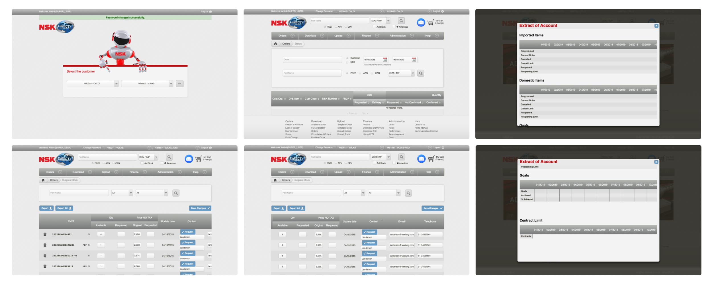
Screenshots from the web portal

Screenshots from the web portal

 
Transitioning from large to small screen

NSK wanted to go one step further on the sales reps process. Instead of asking for a web portal redesign, they requested a different digital experience where the employees wouldn't need to carry laptops anymore, only their cell phones.

Due to development constraints, a hybrid app was what we are requested. An easy and quick way to visualize the products codes, track the sales, and check-in.


Starting the process

I had the opportunity to have co-creation dynamics with some people from the sales team. Having the old portal as the starting point for improvements, I work collaboratively with them using techniques such as How Might We, storyboards, and user interviews. With that, I could get important insights on how to improve existent features and get a better sense of the main pain points when using the web portal, such as:

  • Search doesn't work efficiently - there was no 'suggestion on the search bar when looking for a product
  • The product table doesn't display the information in a useful way
  • Search by date/calendar too confusing to use
  • The system doesn't bring an overview/last added products - the only way to see it was by looking specifically for a product
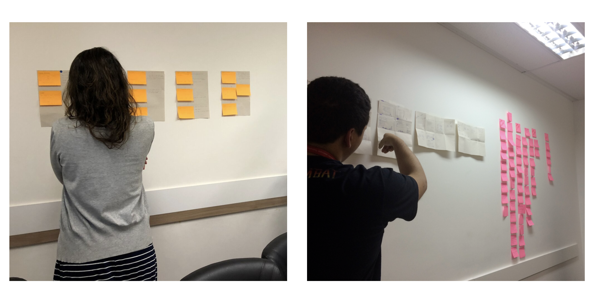
 
 
Storyboard and stick decision workshop
Storyboard and stick decision workshop


Changing the hierarchy

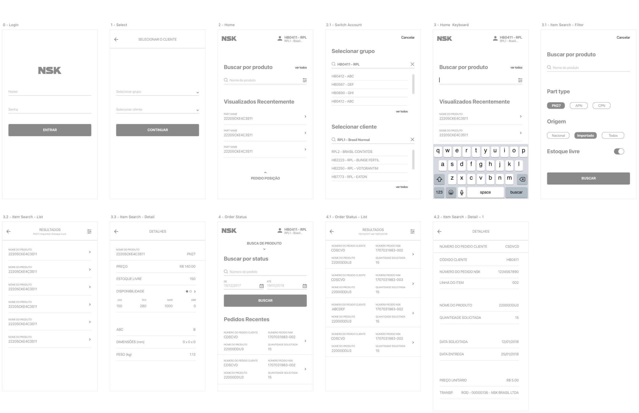
The old portal had numerous inner pages - bad - organized in a confusing way demanding unnecessary clicks. I went through the sitemap to understand the reason why the pages were there and since I didn't find any, I changed the navigation flow and the pages hierarchy so the new app could present an easier and more intuitive experience.

 
Wireframe with the new flow

Wireframe with the new flow

 
Key features

The entire web portal got some kind of complaint from the sales team. And not only the main features such as looking for a product or order, but basic things like log in or shifting between screens.


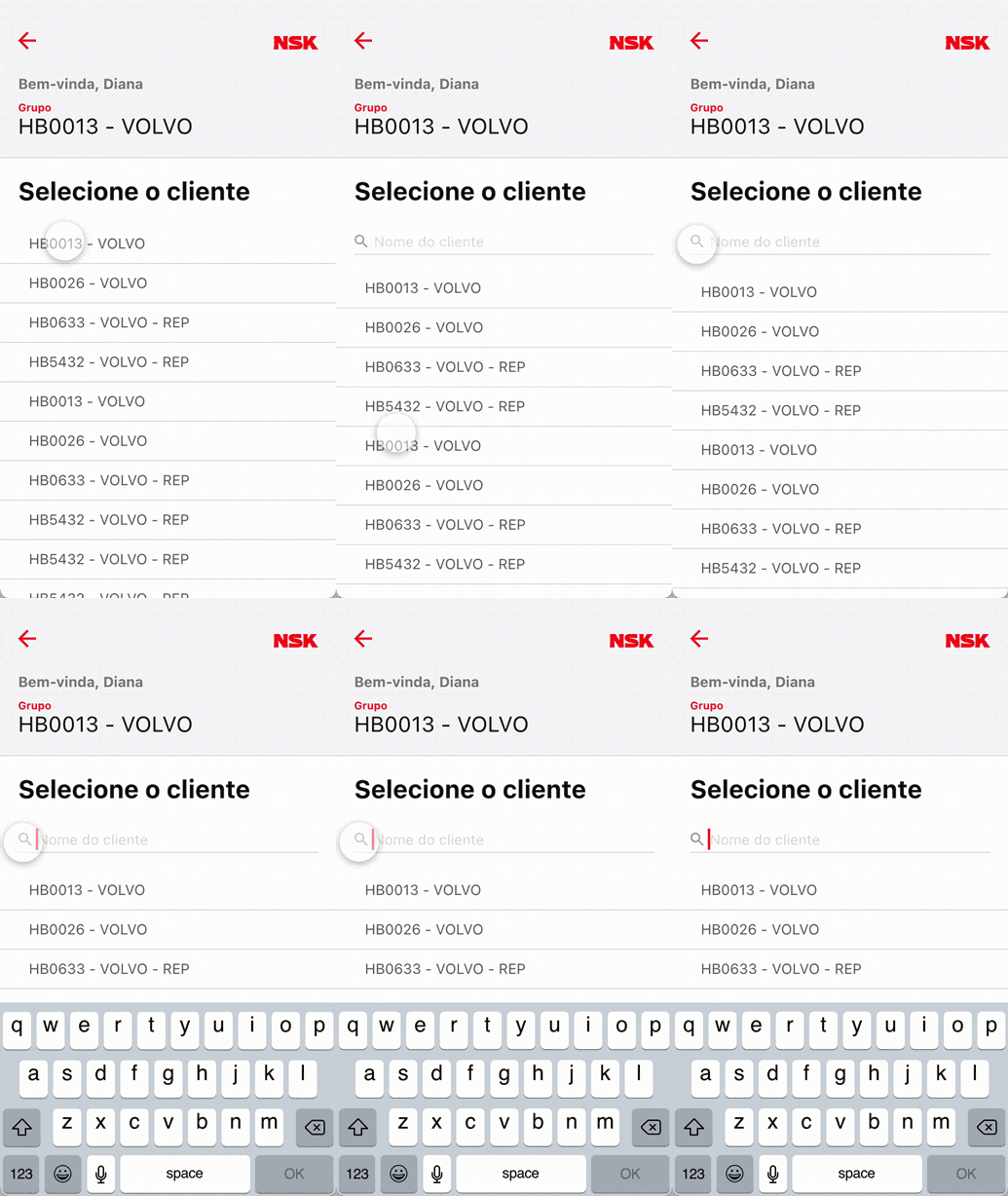
Log in: NSK log in has a step more than usual. To access the system, after entering their credentials, the users have to select the client they'd be interacting with. Every client has a code name that should be placed in the client field. There was no search on the web portal that demanded the users remember the exact name to fill in the field. In the app version, I added a search bar to facilitate it.


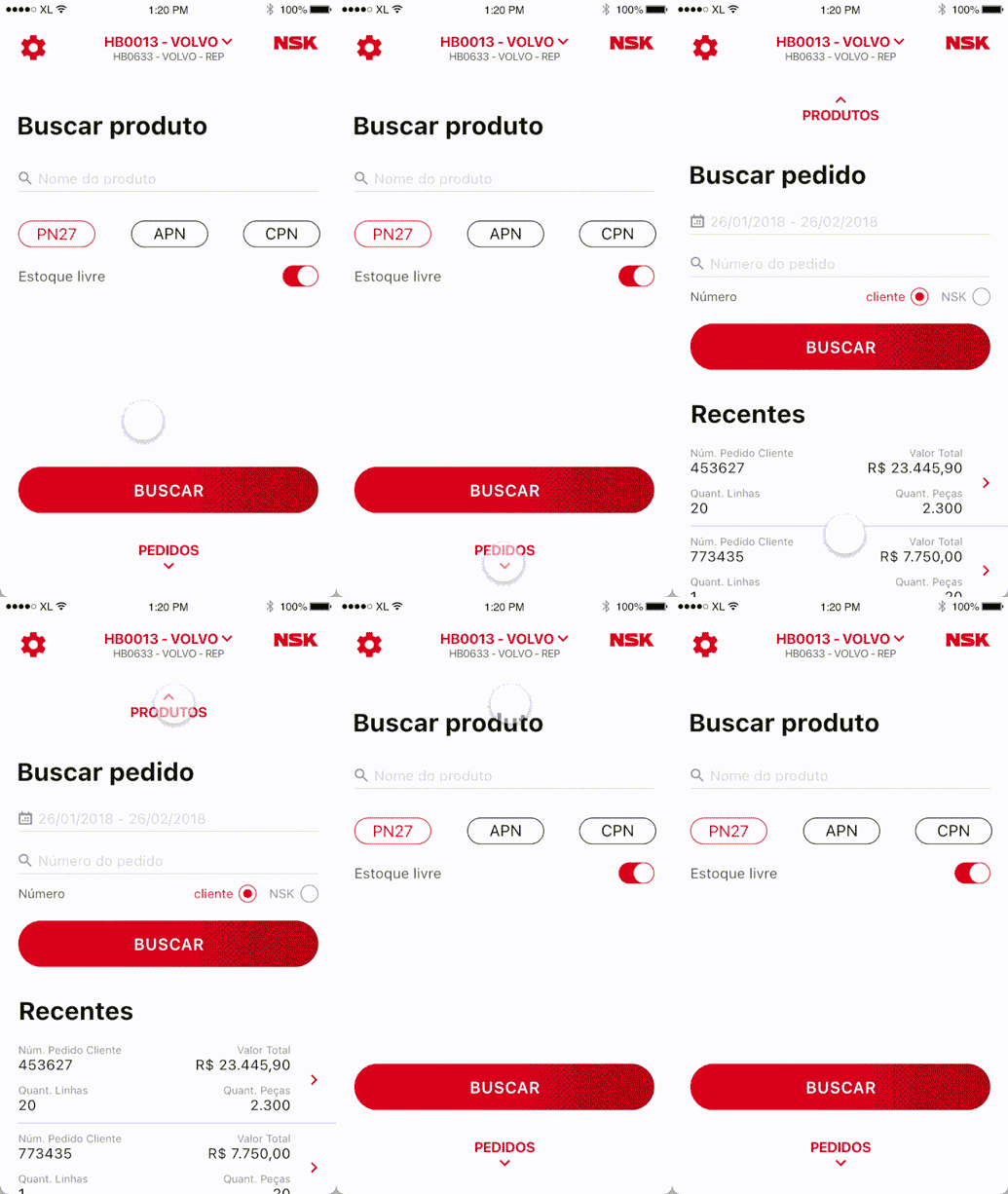
Home - Shifting between screens: There are two main screens - Search for product and Search for an order - and they operate along with each other. On the web portal, the users had to sign in/out whenever they needed to use one or another. On the app, I added a simple way to navigate between the two screens by clicking on the name of it.
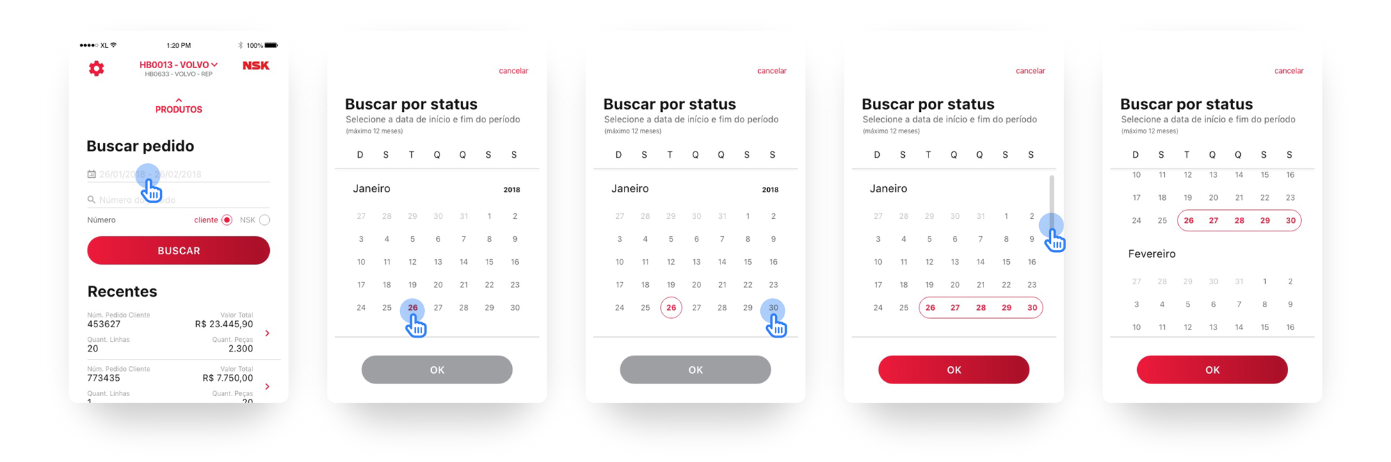


Calendar: This is pretty much an app focused on searching. Not only the search by typing the order number but especially the searching by date range. The calendar designed for NSK provides an easy and clean experience. The flow starts on the main screen, where the user clicks on the date field, and the calendar card is opened. A brief "how-to" text explains how the features work and the OK button only turns red after the flow is completed, informing the user they're ready to go.

 
calendar.png
 
“It’s hard to believe that the experience we had on the portal has been turned into something that pleases the eye and does not require effort to perform any tasks. Thank you very much for helping us with this!”
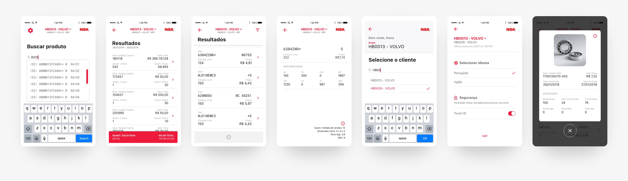
— Regiane Souza • NSK IT Manager
 
nsk-design.png
Previous
Previous

First American Bank | Exchange Platform

Next
Next

Aavri | Digital Bank