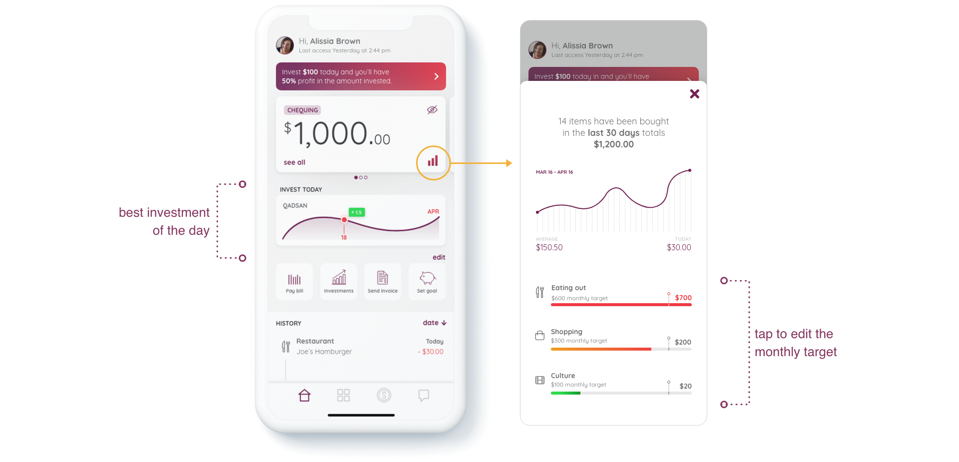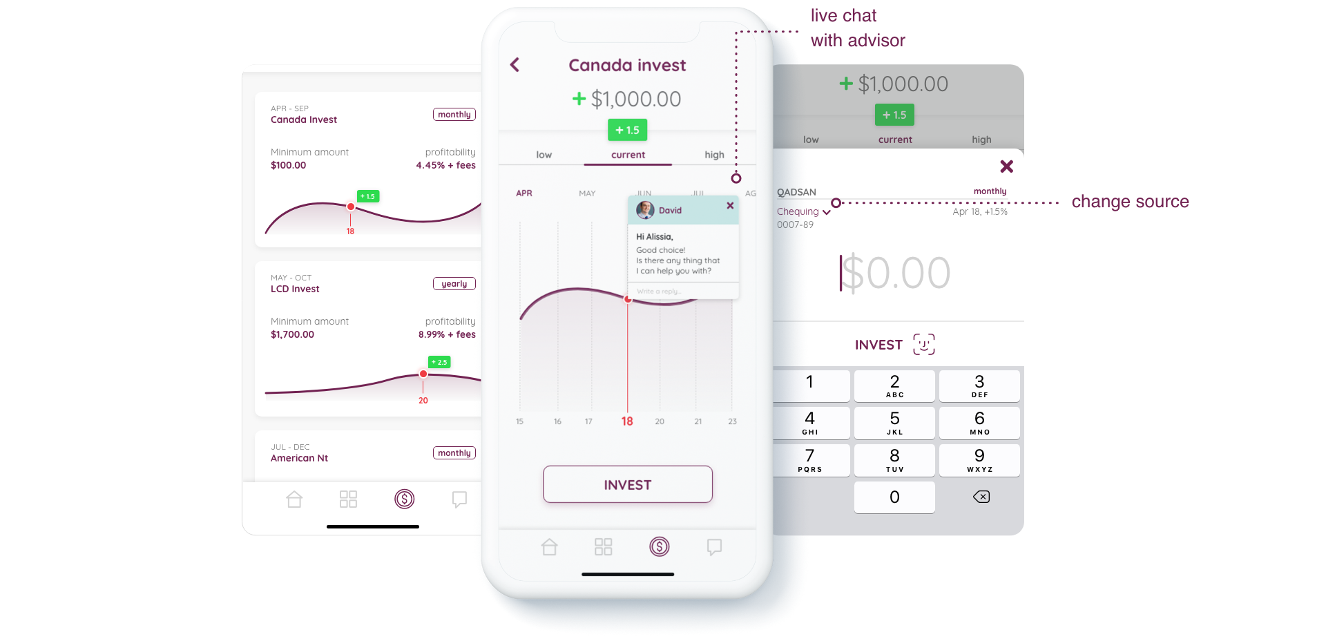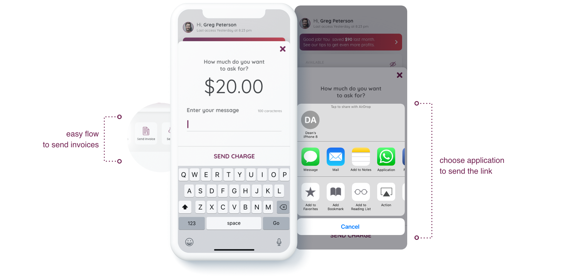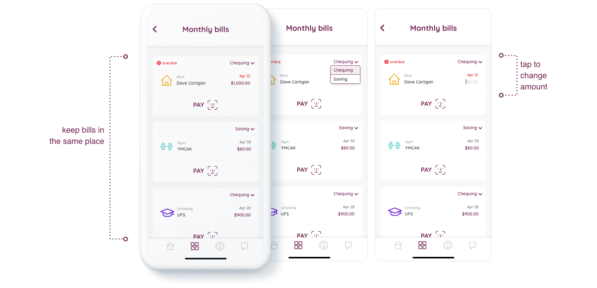
Initially designed for iOS, the app should attend to two different kinds of users: millennials and young professionals. From the briefing:
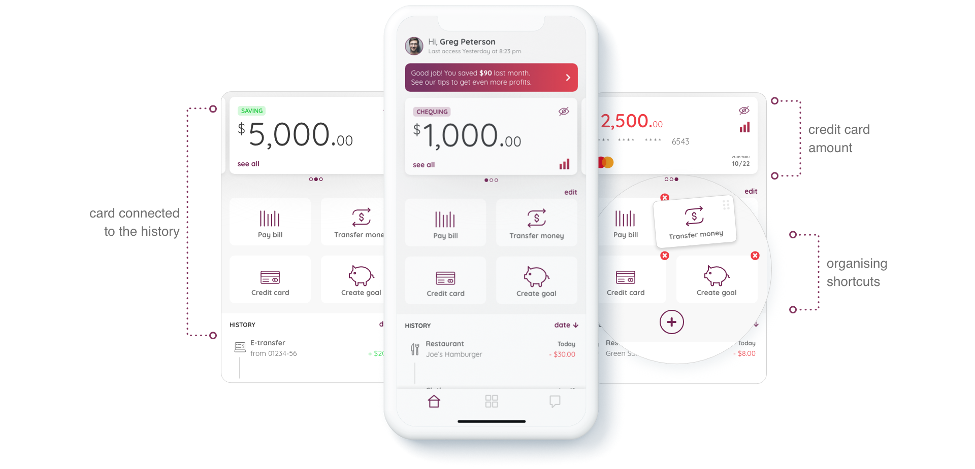
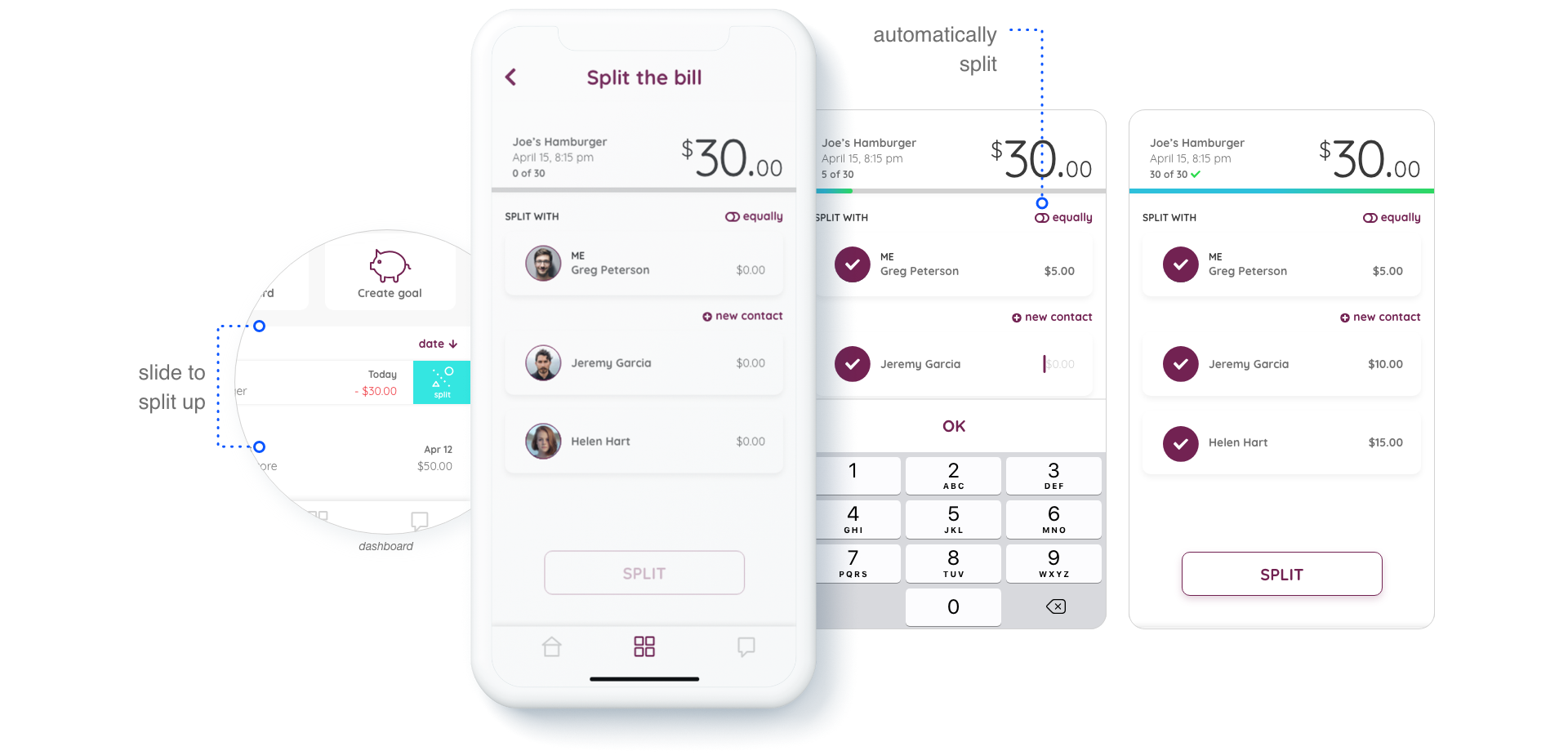
Millennials that are just starting their careers after graduation and like to do everything online. They are new to the banking world and will need a lot of hand-holding. The interface should focus on features that welcome the user to the world of banking based on the actions of their day by day (e.g. splitting a bill with friends). Constant positive reinforcement and financial tips will engender regular and long-lasting engagement.
Young professionals that are looking for true digital experience centered around ease of use and wealth of features. The interface should show the user the importance of taking advantage of different investment opportunities to supplement savings accounts as well as allowing the user to send invoices with ease, all with the help of handy context-based tips and an intuitive interface.
First group: millennials
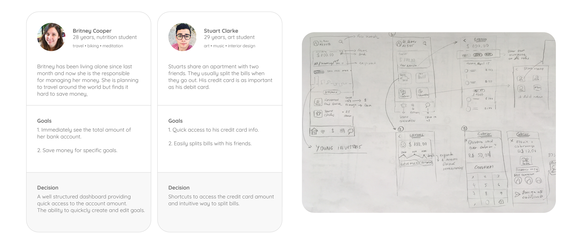
The client provided information about the users so I was able to create the personas and start the first sketches.
The Aavri brand manual was followed to define colours and fonts on the final layout.
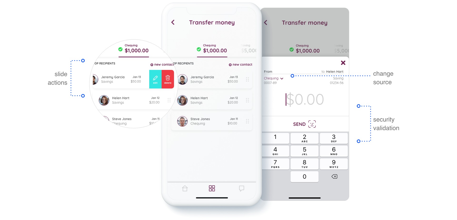
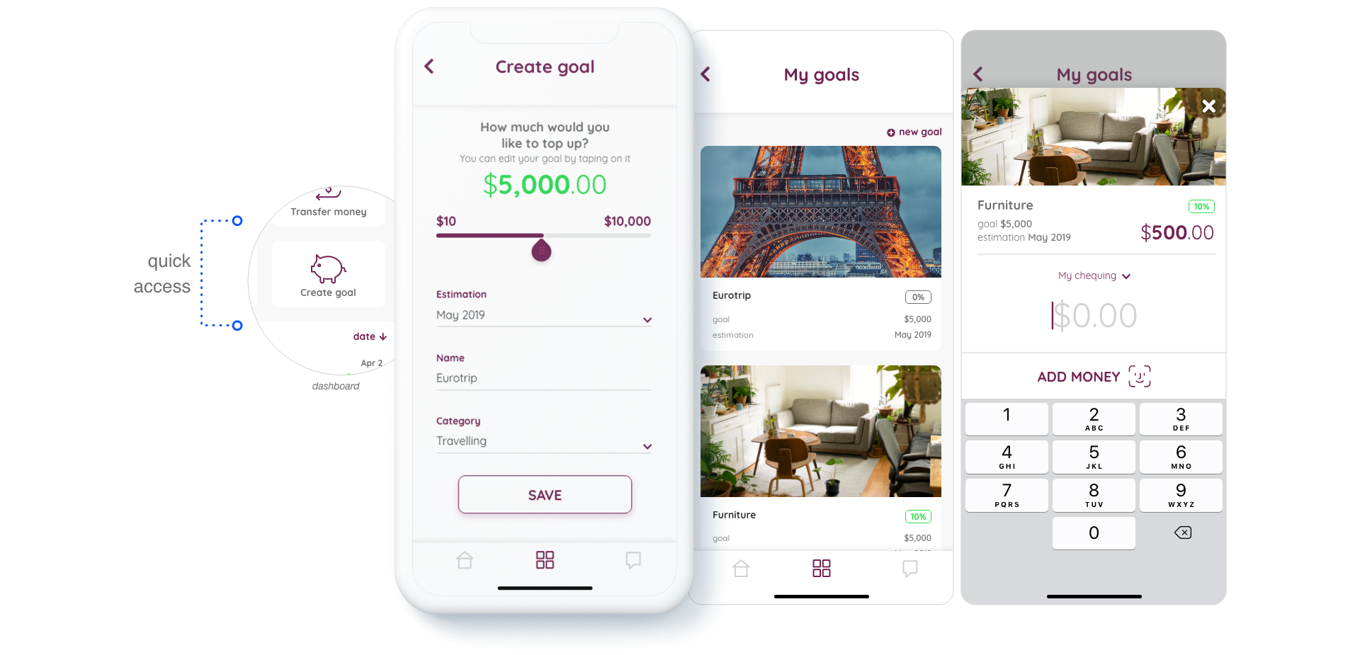
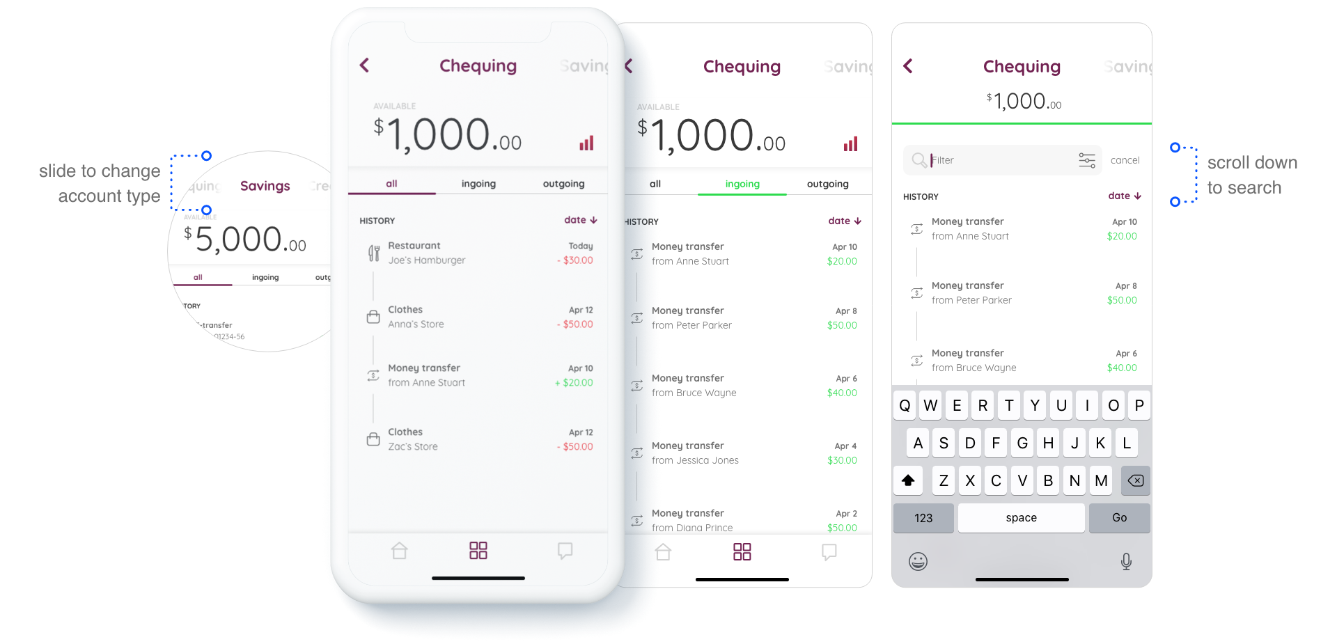
A similar process was followed for designing to the young professionals user group. With the user information and requirements provided by the client, I first created the user personas and sketches to validate the flow.
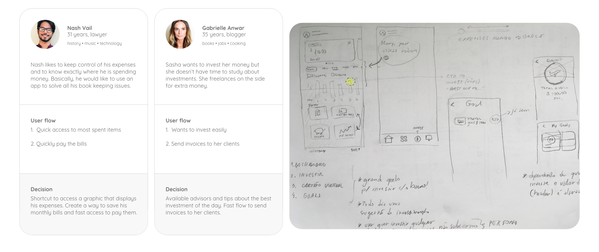
Keeping in mind that the version of the app designed for young professionals could in the future be used by the first user group, I chose using a similar layout that would not require a new onboarding and the users could notice the similarities between the two versions saving time on the how-to-use process.