Pursuing reconciliation with Indigenous peoples

Leading the design process of a new platform for The Ministry of Indigenous Relations and Reconciliation (MIRR), I worked covering methodologies from UX Research, Information Architecture, and Visual Design closely collaborating with stakeholders and developers and also conducting workshops to include all team members in the process.


Wrong tools, slow results

The Ministry of Indigenous Relations and Reconciliation (MIRR) leads the B.C. Government in pursuing reconciliation with the First Nations and Indigenous peoples of British Columbia. They are responsible for tracking the lands that have been taken from the Indigenous people and have been used by companies and start the reconciliation process between the two, and sometimes more, parts involved.
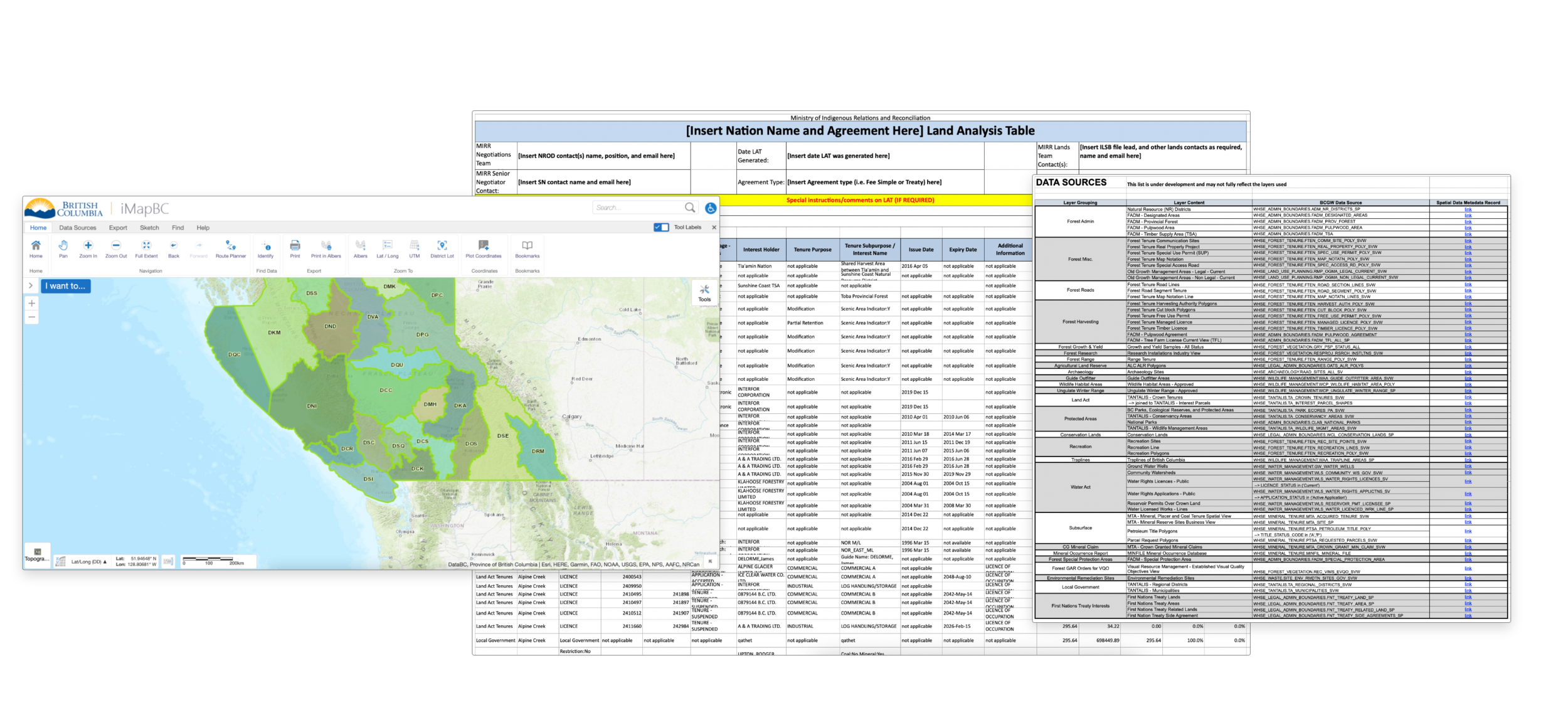
Here are some screenshots of tools used in the process

Here are some screenshots of tools used in the process

Because the reconciling negotiation is such a long process that could take more than ten years to get completed, a tool that facilitates the storage of files and conversations throughout the years was extremely important. The entire process was being documented on MS Sharepoint, Excel, spatial files. Using different software for every different needed feature was costly, causing even more delays in the process and was allowing grounds for miscommunication.

____
Our challenge was to combine the most important features spread out different software and create a unified geospatial, tracking, and communication workflow.

Defining clear objectives and scope
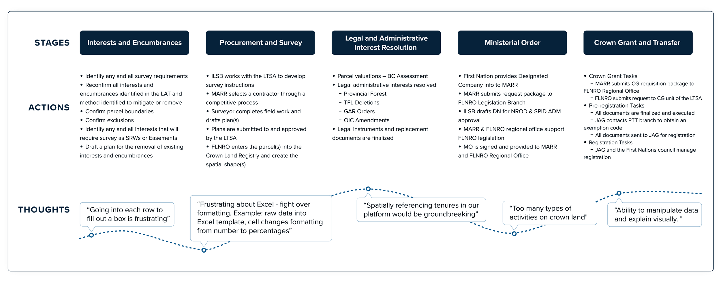
The kick-off meeting with the MIRR team members was a 2 hours conversation to present us how they - magically - go through a process that demanded real-time communication, lots of checking status update, and a really long 30+ columns spreadsheet.

Detail of the journey map

Detail of the journey map

Our first mission was to learn more about their process using user research. We conducted user interviews with the MIRR customers and gained valuable insights into what were the features they most needed in each different software they were using. All customers expressed displeasure in the workflow given the need to switch between programs which makes it hard to keep things organized. They were also frustrated with how many answers/feedback were missed because none of the software had a satisfactory notification centre.

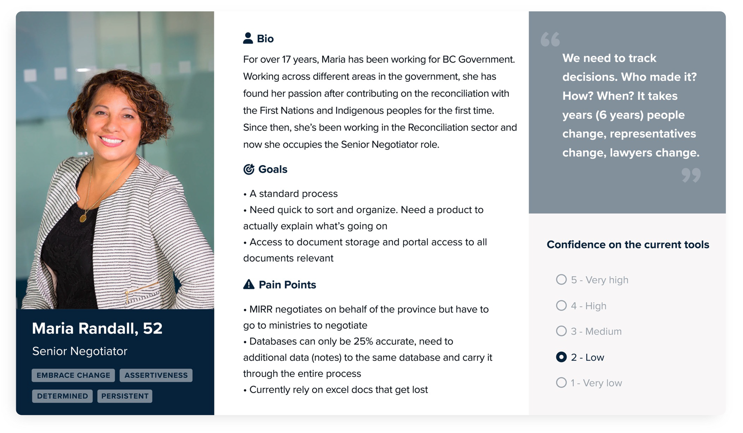
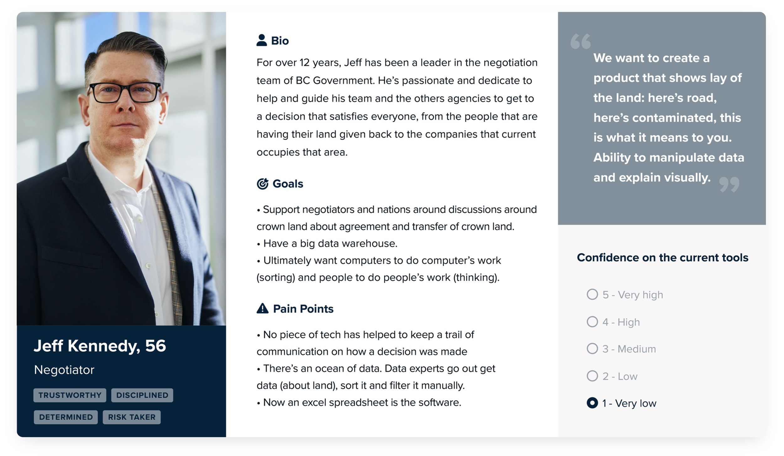
user-persona-1.png
User personas

User personas

From the information gathered on the user research, we created the user personas which allowed us to have different perspectives of how the users would make use of the platform. Summarizing their main requirements for a new tool:

  • Visualization of the lands
  • Multiple users need to track comments and decisions for land packages
  • Comparison of the status of different parcels
  • Agencies need to respond to other parties and know what package to look at
  • Create and export reports

As part of the ideation phase, I conducted a workshop using co-creation dynamics, such as crazy-8, individual storyboards, and stick decisions.
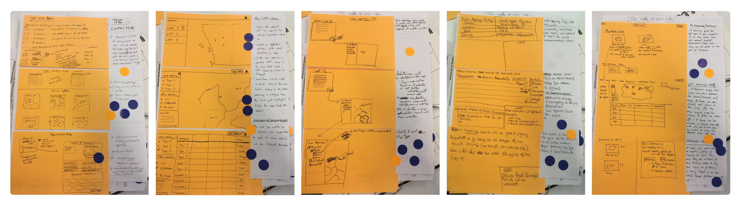
Sketches from the co-creation workshop
Sketches from the co-creation workshop

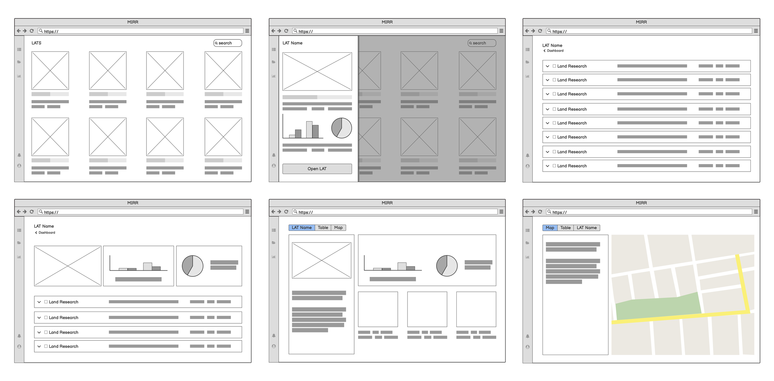
All these materials were carefully analyzed by me, the business team, and the developers. The wireframe was the first visual result of our discussions and the last step before I start the final design layout. We had an internal validation meeting so we could review it before presenting it to the product owner.

Part of the wireframes used during the process

Part of the wireframes used during the process

 
Clean and easy to use interface

As each participant agency should be able to see not only their own status but also the progress of the others parts involved, we needed a quick visual way to inform it.

The dashboard is the initial screen where they could have an overview of the ongoing activities, graphs of agencies' productivity, and others things such as uploading and sharing important files.
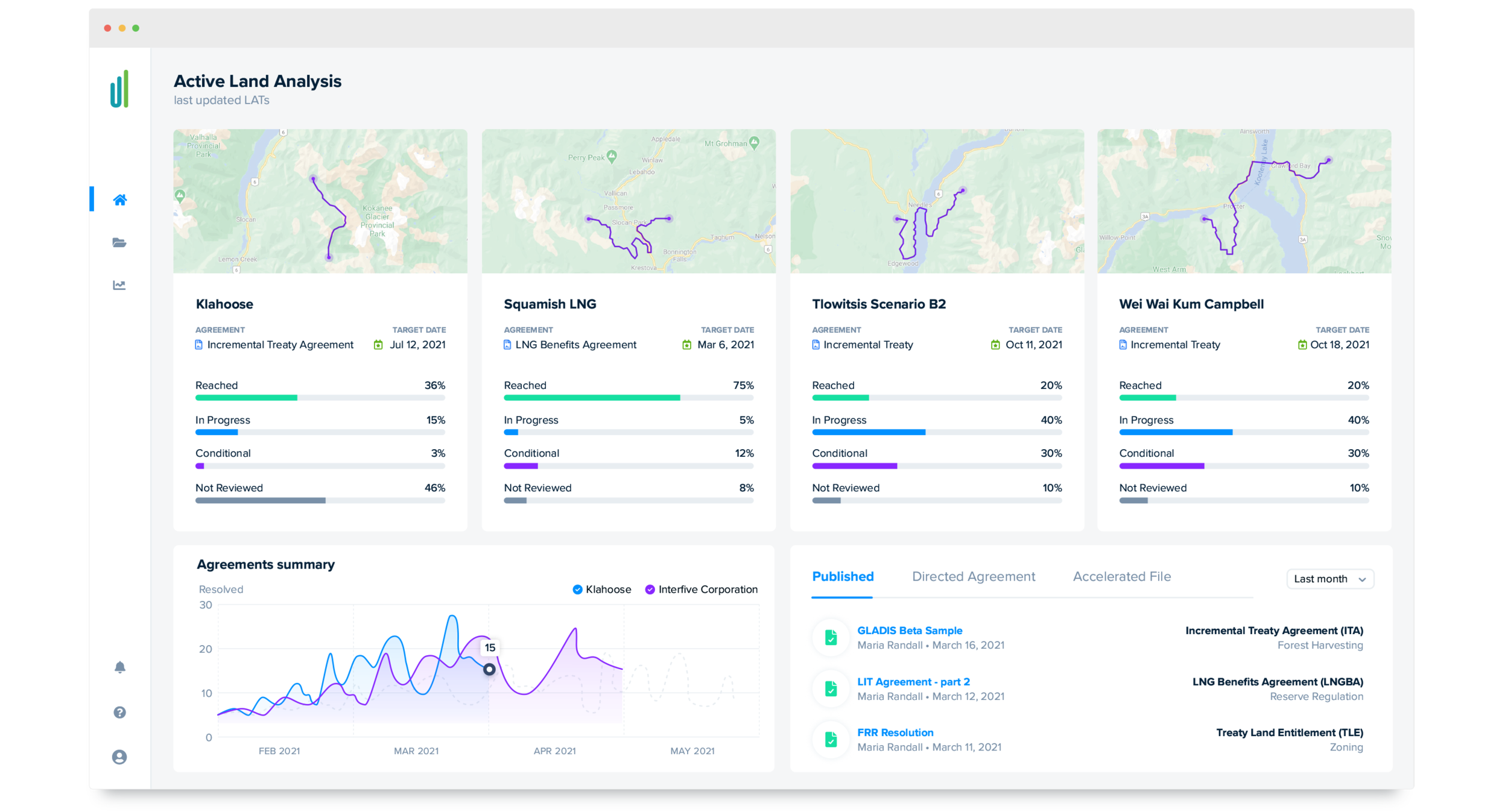
 
Home page: overview on all ongoing projects
Home page: overview on all ongoing projects

 
message-detail.png

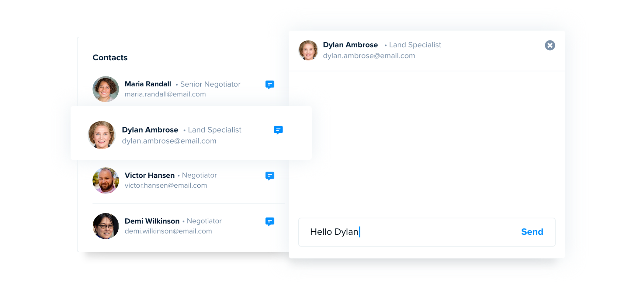
A more efficient way to interact with the other agencies was one of the main requests. The old communication was being made by email that caused long waits. A chat area was designed to address it. Every LAT (ongoing project) has its own communicator which indicates to the user who is involved in that project, saving time on looking for the people working on that and providing interactions in real-time.

 
Selected project view

Selected project view


One of the parts of their process that most hurt my designer soul was the immense spreadsheets they had to deal with on daily basis. As a crucial process tracking tool, it must be improved. I gathered the existent good things about it and also what could be added to improve this stage of the process.


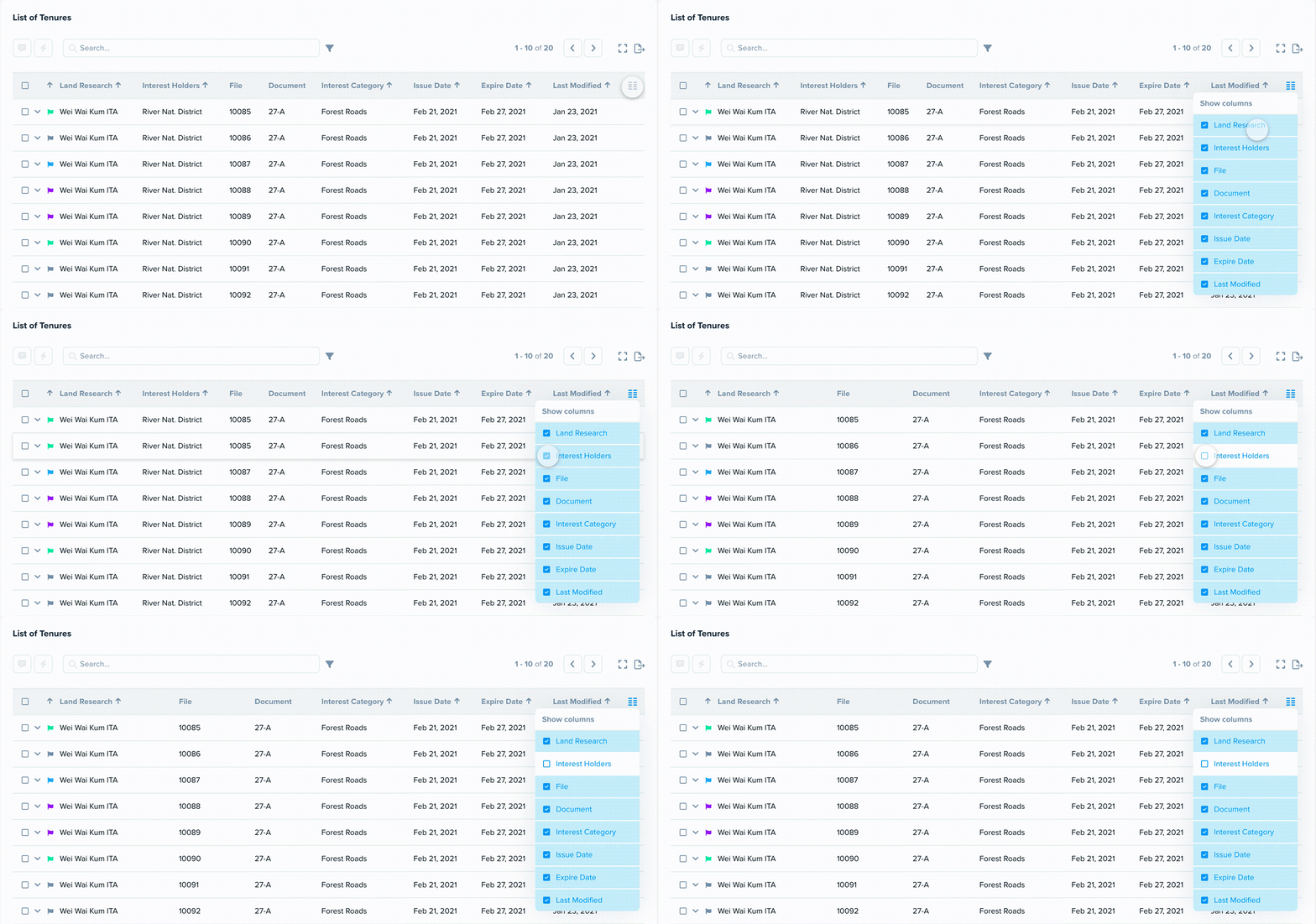
table-column-final.gif

The column's personalization was a simple but powerful feature. Not all the columns are necessary all the time and, depending on the agency, they don't even care about all of them. We got rid of the clutter and focus on the data that is relevant for them.

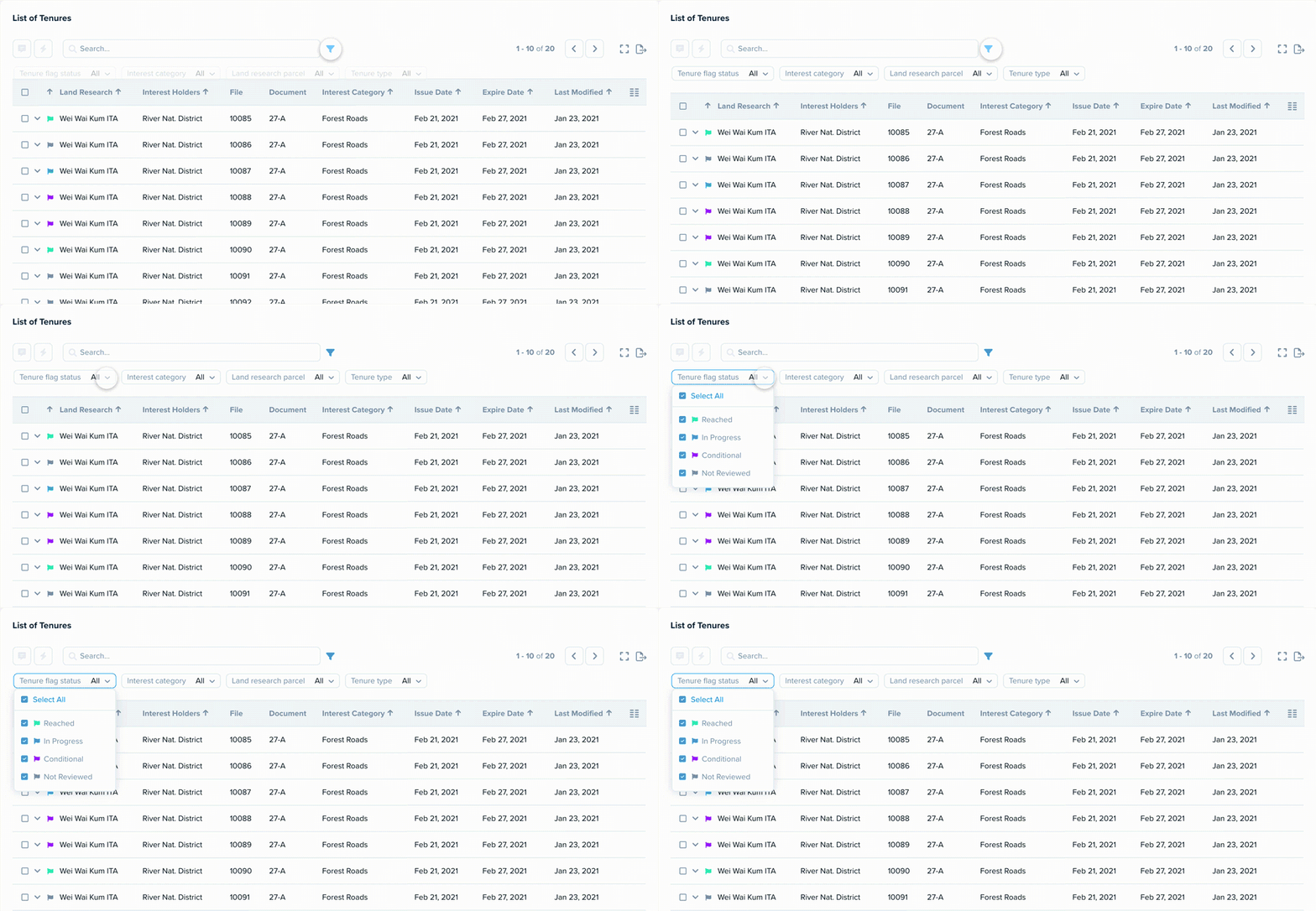
Easy to filter

Easy to filter

A well-thought filter was essential to add more easiness to the table use. The vertical usual displaying of a filter was not the best option for such a huge table. By having it activated only after the click and showing it horizontally saved some space and let the hierarchy of the filter more obvious.


Geospatial explore

Even with the dashboard presenting a summarized map of each project, there was the need for more robust interaction with it. They wanted to have almost all the available features on the table also on the map. Mainly, a way to tag the responsible person for a specific region and quickly change the status of the LAT.

The map tab offers full visualization of the area informing which stage it is and how much it lasts to be negotiated.
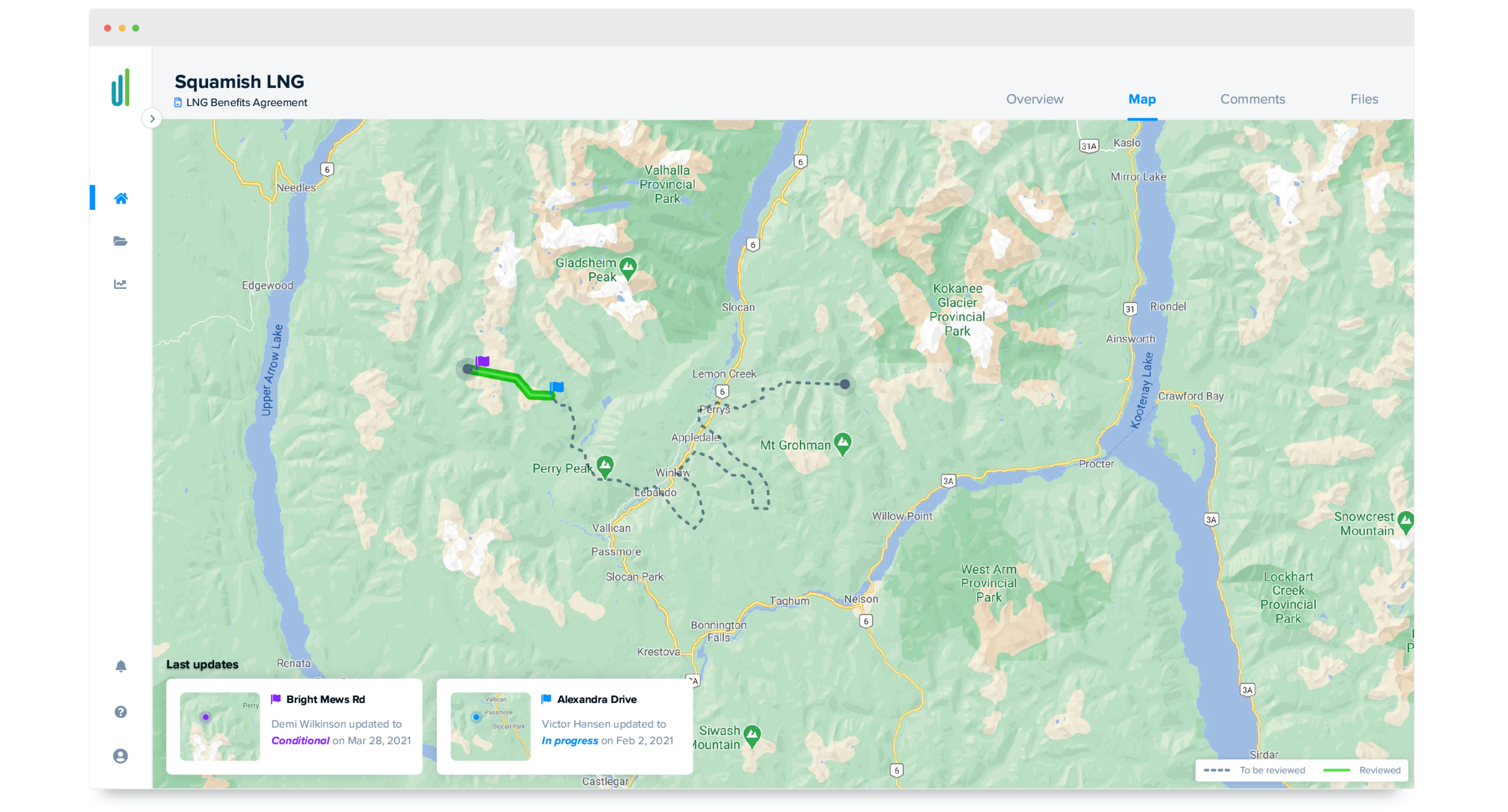
 
The map tab displays a more detail view on the area
The map tab displays a more detail view on the area


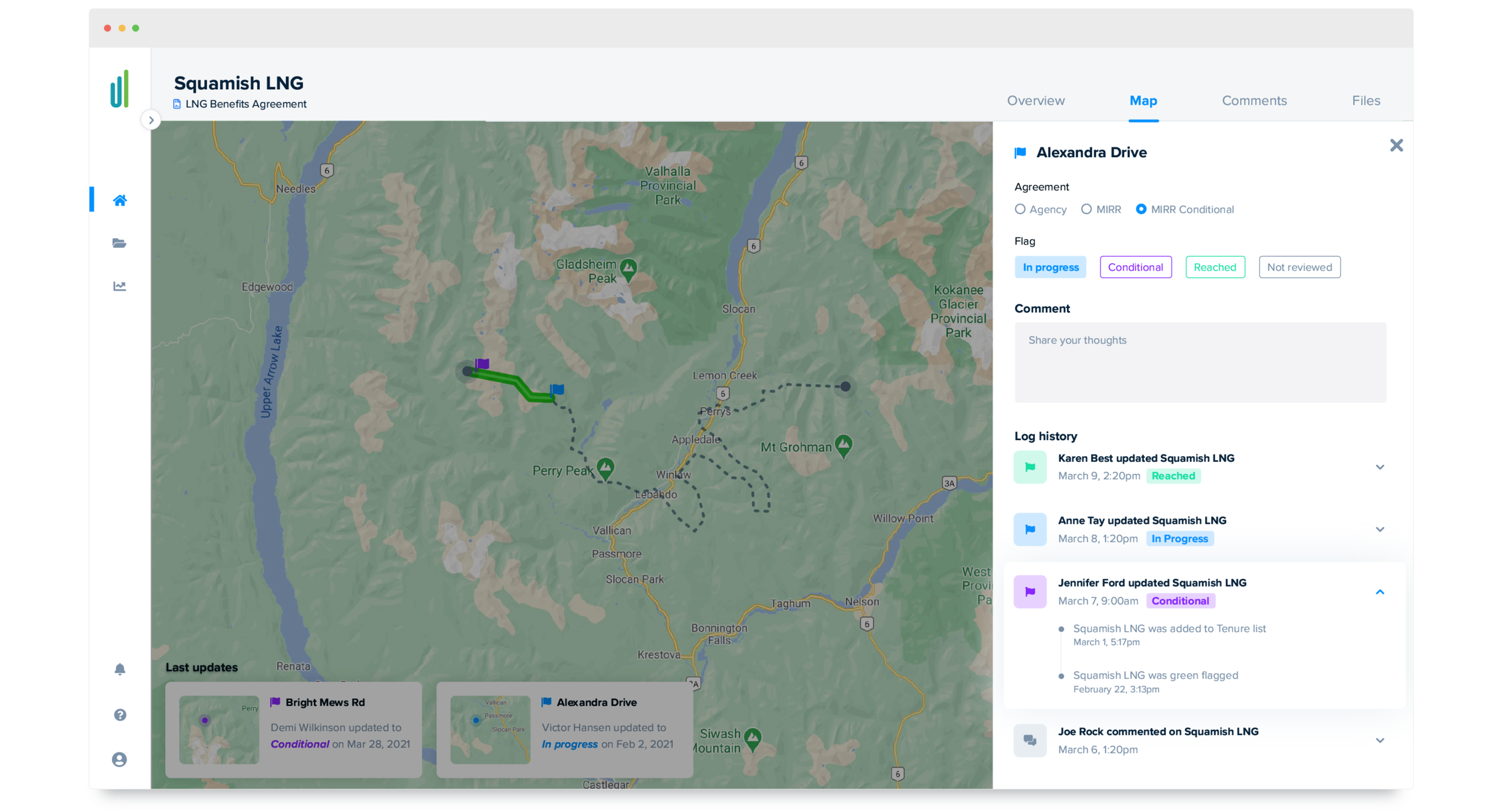
All the past and currently taken actions are also displayed on a side panel that it's opened when the person clicks over the area.

 
Quick interactions on map tab

Quick interactions on map tab

 
Takeaways

Like the majority of projects that need the participation of a designer in all the stages, this was one of the most I learned. Not only about design but literally about human interactions. Some people were scared of participating in the co-creation sections because they thought they "didn't know how to draw". Showing that creativity it's not necessarily connected to illustration skills was a challenge apart. Also, as expected, none of the good results would be possible without the engagement of all the developers who were keen to contribute from the ideation stage to the design review.
 
style-2.png
Next
Next

First American Bank | Exchange Platform